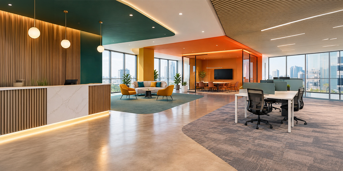
Interior contracting companies in Dubai are increasingly using colour as more than a decorative feature. In open commercial interiors, carefully selected colour transitions can separate areas without adding physical barriers or reducing the sense of space. This approach can help businesses create clear zones while keeping the overall interior visually connected.
Colour can be especially useful when several functions need to share one floor. Reception areas, meeting spaces, workstations and informal seating can each have a slightly different visual identity while remaining part of the same environment. The result is a more organised layout without depending heavily on partitions or enclosed rooms.
Understanding Colour as a Spatial Tool
Colour can influence how people perceive the size, boundaries and purpose of an area. A deeper tone can visually define a particular section, while a lighter shade can make an adjoining space feel more open. When the transition is planned carefully, the change can guide attention without becoming visually distracting.
The relationship between colours is important because abrupt contrasts may make separate zones feel disconnected. Closely related shades can provide distinction while maintaining continuity across the interior. Designers can also use changes in tone rather than completely different colours when a subtle result is preferred.
Useful colour zoning approaches can include:
- Using a stronger tone behind a reception desk to establish a visual focal point.
- Introducing a complementary shade around informal seating areas.
- Applying lighter colours around circulation routes to maintain openness.
- Using a controlled accent colour in meeting or collaboration spaces.
The purpose should always be considered before selecting the palette. A workplace may need a calm atmosphere in focused areas and a more energetic character in collaborative zones. Colour decisions should therefore support how each part of the interior is intended to function.
How Colour Transitions Create Distinct Zones
Interior contracting companies in Dubai can incorporate colour transitions at different stages of an interior project. A transition does not necessarily mean placing one colour directly beside another on a wall. The change can continue through flooring, ceilings, furniture, joinery or selected architectural details.
The position of the colour change can also influence how people move through a space. A transition near an entrance may establish a visual boundary between public and private areas, while a change along a circulation route can indicate where one functional area begins. This gives the layout a sense of direction without physically dividing it.
A well-planned transition should work with the wider architectural arrangement rather than appear as an isolated decorative feature. Wall finishes, furniture, flooring and ceiling elements can support the same visual intention. This makes the distinction between zones easier to understand while preserving a unified interior.
In the country, open-plan commercial spaces often need to accommodate multiple activities within a limited footprint. Colour can help establish these distinctions without creating a series of enclosed compartments. This can preserve natural sightlines while giving each zone a recognisable identity.
Coordinating Colour With Flooring and Ceiling Elements
Flooring can provide one of the most effective ways to introduce visual distinction. Different materials or shades can indicate a change in function while keeping the floor plan physically open. However, the transition should be planned carefully so that it looks deliberate and does not interrupt movement.
A similar principle can be applied to ceilings. Changes in ceiling colour, lighting arrangement or finish can reinforce the boundary created by a wall or floor treatment. When these elements work together, the result can provide stronger visual definition without relying on additional construction.
Interior fit out contractors can coordinate these elements during project planning. Their involvement can help ensure that colour changes align with flooring joints, ceiling features and other installed components. This reduces the risk of the design appearing disconnected once different finishes are installed.
The transition between materials also needs practical consideration. Areas exposed to heavy traffic may require finishes that can withstand regular use and cleaning. A visually attractive concept should therefore remain suitable for the conditions of the space.
Using Colour to Differentiate Workplace Functions
Modern workplaces often contain several environments within the same floor. Quiet workstations, collaborative areas, private rooms and informal meeting points can have different requirements. Colour can help communicate these differences without making the layout feel fragmented.
A consistent base palette can provide the foundation, while carefully selected accents can identify specific functions. This approach allows businesses to maintain a coherent identity while giving each area its own character.
A practical workplace colour strategy may include:
- Softer shades for areas intended for focused work.
- Distinct accent tones for collaboration zones.
- Neutral backgrounds around technology-heavy work areas.
- Warmer colours in informal breakout spaces.
For an office fit out Dubai project, colour selection should also account for natural light, artificial illumination and the amount of activity in each area. A shade that appears balanced during daylight may look considerably different under artificial lighting. Testing samples within the actual interior can therefore provide more reliable results than selecting colours solely from printed charts.
Applying Colour Zoning in Commercial Interiors
Commercial fitouts can benefit from colour zoning when different activities need to coexist within one environment. Retail areas, hospitality settings, clinics and business premises may all require visual separation between customer-facing and operational spaces. Colour can provide that distinction while keeping the overall layout accessible.
The approach can be particularly useful where structural changes are limited. Instead of constructing additional walls, businesses can use finishes to suggest boundaries between areas. This can reduce visual heaviness and maintain a stronger connection between different parts of the interior.
Colour can also support brand identity when used with restraint. A company’s established colours can appear in selected zones rather than being applied throughout the entire space. This creates recognition without overwhelming the interior with repeated branding elements.
For a commercial project in Dubai, the palette should also respond to the character of the property and the intended audience. A professional office may require a different visual approach from a retail environment or hospitality venue. The colour strategy should therefore be developed around the specific use of the space.
Combining Colour With Fit-Out Design Details
Fit out design becomes more effective when colour is considered alongside the physical features of the interior. Walls, partitions, doors, counters and built-in storage can all influence where colour transitions appear. A coordinated approach prevents the palette from looking like an isolated decorative layer.
Transitions can be subtle around architectural features. For example, a change in wall colour can follow the edge of a built-in unit or align with a doorway. This can make the transition appear naturally connected to the structure rather than randomly placed.
Furniture placement can reinforce the same visual divisions. Seating, desks and storage units can be arranged within the zones created by colour, making the relationship between the visual and functional layout clearer. The transition does not need to follow straight lines in every case, provided the chosen form complements the wider architecture.
Careful detailing is also important where several finishes meet. Edges, junctions and changes in material need to be considered during the design stage. This helps ensure that the intended visual effect remains clear after installation.
Creating Visual Continuity Through Interior Design
Fit out interior design can use colour transitions to connect spaces that serve different purposes. Rather than giving every room a completely separate palette, designers can carry one or two shared tones through adjoining areas. This ensures continuity even as each section maintains its own unique focus.
The transition from one color to another related shade works very well in larger spaces. There is no jarring disruption in vision when moving from one place to another.This technique can also help smaller spaces feel connected when they have different functions.
The choice of finish matters alongside colour. Matte surfaces, textured materials and reflective finishes can make the same shade appear different depending on the amount of light reaching it. Samples should therefore be assessed together rather than treating colour as an independent decision.
Lighting should be coordinated with the final palette as well. Accent lighting can strengthen a selected area, while general illumination can maintain consistency across connected spaces. The aim is to make the transition visible without making it feel forced.
Planning Colour Changes During Project Coordination
Interior design & fit out services should consider colour zoning before construction and finishing work begins. Late changes can affect material orders, joinery details, lighting positions and installation sequences. Early coordination gives the project team a clearer understanding of how each transition should be delivered.
A coordinated colour schedule can identify the intended finish for different surfaces. This is particularly useful when several materials are being used within the same area. It helps reduce confusion between design intent and the final installation.
The planning stage should consider:
- The exact location where each colour transition begins and ends.
- The materials or finishes that will carry each selected tone.
- The relationship between colour changes and lighting.
- How future repairs or replacement materials will be matched.
Sample boards can also help stakeholders review the proposed combination before installation. Colors may look different depending on the materials around them, and assessing them in context will eliminate any surprises. This process can prove to be extremely useful when working with commercial interiors, where a minor color decision may cover an entire room.
Connecting Design Intent With Construction
Fit out construction companies need clear information when colour transitions form part of the architectural concept. Wall finishes, flooring, ceilings and joinery may be completed by different trades, making coordination important. A clear drawing or finish schedule can help maintain consistency throughout installation.
The sequence of work can affect the final appearance as well. If one surface is completed before another, the meeting point between finishes needs to be accurately established. Small inconsistencies can become noticeable where two contrasting colours meet.
In Dubai, commercial projects may involve tight schedules and several specialist teams working at the same time. Clear coordination can help reduce avoidable adjustments during finishing stages. It also allows design details to be checked before they become difficult or expensive to alter.
Quality checks should focus on more than whether the correct colour has been used. Alignment, edges, junctions and consistency across repeated areas can all influence the finished result. A carefully planned concept deserves the same attention during execution.
Conclusion
Interior contracting companies in Dubai can use colour transitions to give open interiors clearer structure without relying on additional walls. By coordinating colour with flooring, ceilings, furniture, lighting and architectural details, different zones can remain visually distinct while still feeling connected. The most effective approach is not simply to introduce more colours, but to use selected tones with a clear purpose. When the design is properly coordinated from planning through installation, colour can become a practical tool for shaping commercial interiors while preserving openness and visual continuity.
Fit Out UAE offers comprehensive services as one of the experienced interior contracting companies in Dubai, supporting commercial projects with coordinated design, fit-out planning and quality-focused execution.
Frequently Asked Questions
How can Interior contracting companies use colour transitions to define separate areas without walls?
Colour transitions can visually distinguish different functions by changing the tone, shade or finish across selected areas. When coordinated with furniture, flooring and lighting, these changes can suggest boundaries while keeping the physical layout open.
Can colour zoning work in a small commercial interior?
Yes. A carefully controlled palette can help define different functions without making a smaller interior feel divided. Using related shades and limiting strong contrasts can maintain a sense of openness.
Should colour transitions match the company's branding?
They can reflect brand colours, but the entire interior does not need to follow the corporate palette. Selected accents can provide recognition while neutral supporting tones keep the space balanced and comfortable.